
Designing a Mobile Purchasing App for Kemptown Bookshop
Case Study
As part of my Google UX course, I designed a mobile purchasing app for Kemptown Bookshop, a local bookstore
in Brighton, with the goal of expanding their customer base.
To achieve this, I focused on creating an intuitive and user-friendly checkout flow, that would accommodate user needs, ensure an enjoyable app experience and potentially boost sales revenue for the bookstore.
Outcomes + findings
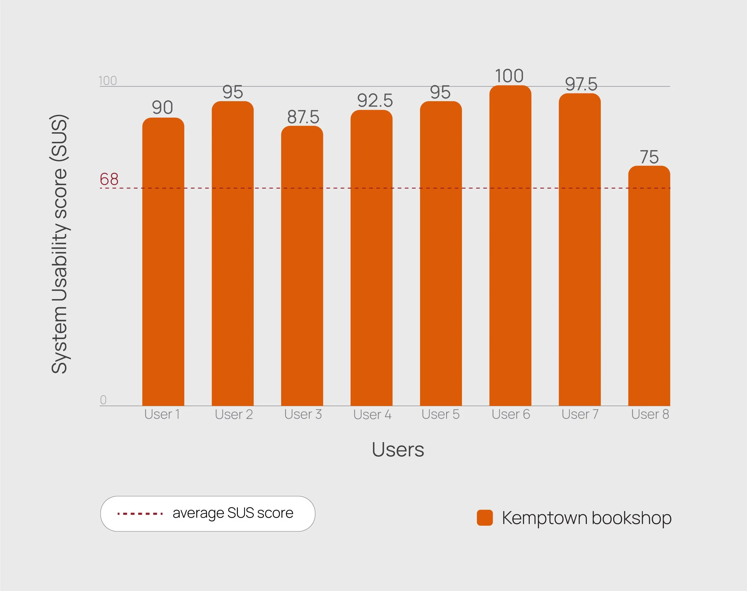
Designed a book purchasing app for Kemptown Bookshop that performed well in usability testing, earning System Usability Scale (SUS) scores from 87.5 upward —reflecting a consistently positive user experience.
Through usability testing learned how to create user centered and accessible UI.
Came up with a concept and look for a potential loyalty card system, that could increase customer base for the bookshop.
Made original drawings for the app, creating an elevated look.
Research
To begin my case study, I set out a research goal to identify key features that contribute to the success of a mobile book purchasing app, as well as explore additional qualities that could effectively target their audience and drive sales growth.
To start my research process, I went to the bookstore to gather data about the Kemptown bookshop.
There I learned how the bookshop serves as a vital community hub:
The bookshop hosts a wide range of reading events for both adults and children.
The bookshop runs a monthly 5 AM writing club at their cafe upstairs
The bookstore offers three other book clubs for people of different ages and reading preferences
The bookshop staff have put up hand written book recommendations throughout the shop
There are book subscription services for both paperback and hardback books available

Staff picks are written across the whole bookshop

Upcoming events at the bookstore
After getting a better understanding about the bookstore, I was keen to learn about their customers. Through a conversation with a bookseller, I discovered that their primary customers are students from Brighton College and local NHS hospital workers. This confirmed my assumption that their clientele is largely local.

Following these findings, I decided to learn about Brighton and Hove residents firsthand and carried out a screener survey that would both give me data about their shopping and reading preferences as well as help me select users for a moderated user study.
Through a screener survey I learnt that 75% of the survey respondents had heard about the Kemptown bookshop and only half of all participants had been there. Their preferred online shop was Waterstones, while Amazon came second and World of Books third.
When asked what makes them choose a specific retailer, most correspondents brought up:
belonging to the retailer’s loyalty system
competitive prices + offers (e.g. buy one, get one half price)
large range of books
retailer having many collection points for delivery
Research goals
Based on the research above, I came up with a hypothesis statement for this case study:
I believe that an intuitive and easy to use bookshop app will help customers purchase and get their book efficiently, increasing customer’s loyalty and sales revenue for the bookstore.
Wireframes
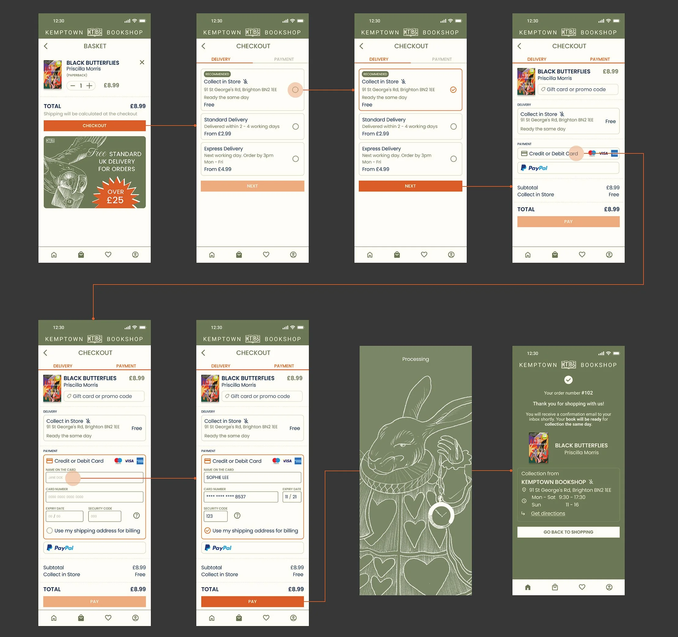
To start, I created wireframes for the key app screens necessary to test the checkout flow, including a homepage, a book page, a basket screen, and a three-step checkout process made up of delivery, payment and confirmation screens.
Later on, I added a profile page together with my orders section, to help people track their orders and assist their physical journey to collect the book.
In order to stay on track of addressing research goals, I designed the case study process around regular cycles of prototyping and iterating as well as a few face to face user sessions. This helped to validate design decisions with input from real users.
Both low and high fidelity prototypes were tested during a moderated usability study. Drawing on the findings collected during face to face sessions, I had to make a few iterations:
Utilised negative space on the homepage in order to accommodate a large amount of content on the page and maintain ease of use
Simplified checkout flow from three-step to two-step buying process
Added the bookstore's address and working hours to the confirmation screen to facilitate users making physical journey to collect their book
Designing the homepage

Homepage - top section
-
To begin with, I placed a search bar at the top of the page based on the user interviews and a screener survey. It revealed that customers usually open up a bookstore app with a specific book in mind.
In addition, I introduced a range of filters for specific genres to facilitate the main navigation and help users customise the homepage based on their desired book genre. -
Regarding the content, I introduced a swipe-able list of selected books the top of the screen. To catch the users attention, I put a book of the month first, followed by a new release and the most anticipated book. Having a stand out section was crucial not only to keep the app engaging for users but also to effectively organise and display a large volume of information and products on the screen, which was a key challenge to me.
-
In addition, I created simple illustrations to the selected books section to give it a more personalised and elevated look. Previously, I made an illustration of a hand holding a book, that was seen throughout their website and social media.
However, this option looked unrealistic from the engineering point of view and made the app look cluttered. This led me to making drawings that corresponded with the category of a selected book, while not overwhelming the homepage. -
To bring the app in-line with the web experience, I made specific buttons for local books, signed copies, staff recommendations. Furthermore, I added buttons for book subscriptions and gift vouchers that would take the user to their assigned page.
To maintain the app's simplicity and ease of use, I designed lists for the events, bestsellers, and new releases sections, providing users with a quick and clear overview of what’s happening or newly available.

Homepage - events section
Designing the checkout flow
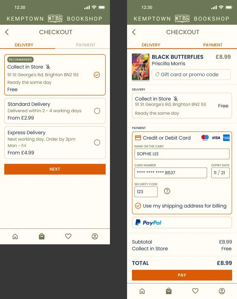
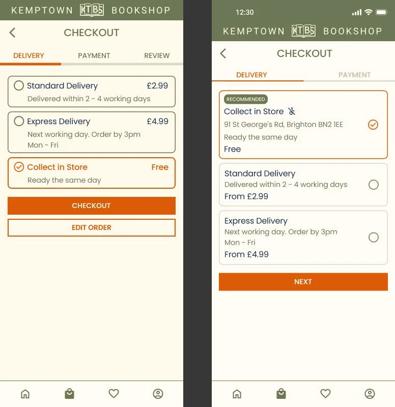
At the start of the design process, I sketched out wireframes for the checkout process as a three-step flow. I thought that having a confirmation screen would be beneficial for the customer.
However, user testing revealed that reducing the number of checkout steps did not impact the completion rate. All the essential information, such as the item, price and customer address, have been placed for the user to check before putting in their payment details.

3 step checkout screens
2 step checkout screens
Design iterations
Regarding design iterations, I had to enlarge delivery buttons and place the tick box for delivery options on the right side of the screen to make it more accessible to the user and to aid the navigation.
Delivery screen before and after iterations
Another accessibility iteration was introducing a clear non-wheelchair accessible icon next to ‘collect in store’ delivery option. Creating a persona with mobility impairment highlighted critical accessibility gaps in their experience and it was vital to make this app as inclusive as possible.
In addition, I re-positioned the 'collect in-store' option at the top of delivery choices with the hope to appeal to people for whom a delivery fee would be a deterrent.
Based on the findings that 50% of the screener survey participants didn’t know where the bookshop was, I added a bookshop address in collect in store feature as well at the end of the checkout flow. This would greatly help users make the physical journey to the store and save them time completing the checkout screens.
Checkout flow
Regarding the look of the app, I maintained the established brand identity and used Kemptown Bookshop’s green that is seen throughout their website and social media.
In order to make this app stand out, I made illustrations related to famous book characters and incorporated them throughout the app.
While thinking about the whole user journey of buying a book, I had to recognise the journey that takes place after an order is placed. Therefore, I added a section to help customers track the progress of their orders.

Designed My Orders section to help users track their order and aid their post purchase experience
System Usability Scale (SUS)
For this case study, I asked moderated usability test participants to complete a system usability scale (SUS) at the end of the test.
Considering that this prototype was not done in a way to accommodate different steps taken in the checkout process (besides delivery options), I thought that I would not be capable to collect realistic data. Therefore, I set to gather data about perceived usability of the app.
KPI
-
Measuring time on task (could compare the time it takes to buy the same book on a competitors app)
-
These results are based on impressions from testing the checkout flow, which represents only one part of the overall app experience.
Users that were selected for this study are my friends and it is likely that some of these results are biased
Impressions and notes collected from the usability study:
One user said that some of texts could have higher visibility. The colours and overall design are easy on the eyes, app does not feel messy or cluttered.
Another user would like to see a more tailored homepage. Once registered, you should have an option to select what kind of genre you like so your homepage would be tailored based on your taste.
Loyalty card
Based on the research collected in this case study, I set out to explore Kemptown bookshop having a loyalty system that could help attract new customers and turn them into repeat customers.
While looking into competitors, I came up with a system where customer’s could get 50% off a paperback book if they collect 5 stamps from purchases above £9.50. This loyalty system is similar to what Waterstones plus card offer - £10 to spend after a customer collects 10 stamps from every £10 purchase.
However, I figured it would make the Kemptown bookshop more attractive if the number of stamps was cut by half. Considering that it is a singular retailer, it can be harder for their customers to make the trip.

Mockup screens for how the loyalty card system could look like
Another option to increase sales revenue for the bookshop could be to offer a promo code whenever they get someone to sign up for the app and buy a book.