
Improving the Booking System of
King Alfred Leisure Centre
(Freedom Leisure)
Case Study
For this case study, I chose a real-life issue I faced when booking a class online at my local leisure centre.
Despite its modern appearance, the booking system of the leisure centre appeared to be outdated, requiring users to repeat booking steps unnecessarily.
I wanted to examine if other potential customers would be experiencing the same usability issues I did and whether there were ways to improve it.
Outcomes + Findings
Time-on-task data revealed that the prototype reduced activity booking time by 86.73% compared to the live Freedom Leisure website.
Users rated the improved prototype significantly higher in perceived usability on the System Usability Scale (SUS), with scores ranging from 85 to 100, compared to the Freedom Leisure website, which scored below average (15–52.5).
This case study revealed that a browser choice significantly impacts website usability, with Safari demonstrating the highest compatibility for the live Freedom Leisure website.
Research
To start, I conducted user research to better understand user behaviour and experience which would help me identify areas that needed improvement.
Since my primary focus was the booking flow, I set out a research goal to identify the biggest painpoints users face while trying to book a class or an activity online.
My target audience were people who lead an active lifestyle and wanted to find and book a class online. I set out to conduct user research by interviewing 4 users who fit the criteria and made a good representative sample.
Main findings
Having gone through a round of interviews and a usability study of the existing website, my assumptions were confirmed - users found the booking flow to be deeply frustrating and time consuming.
They were redirected to a second booking website after they chose to book a specific class and had to go through a more outdated search
system again.
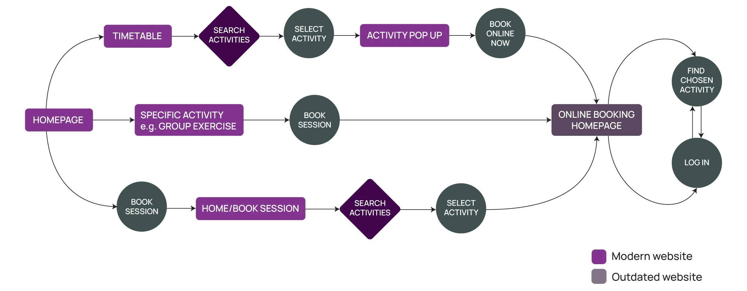
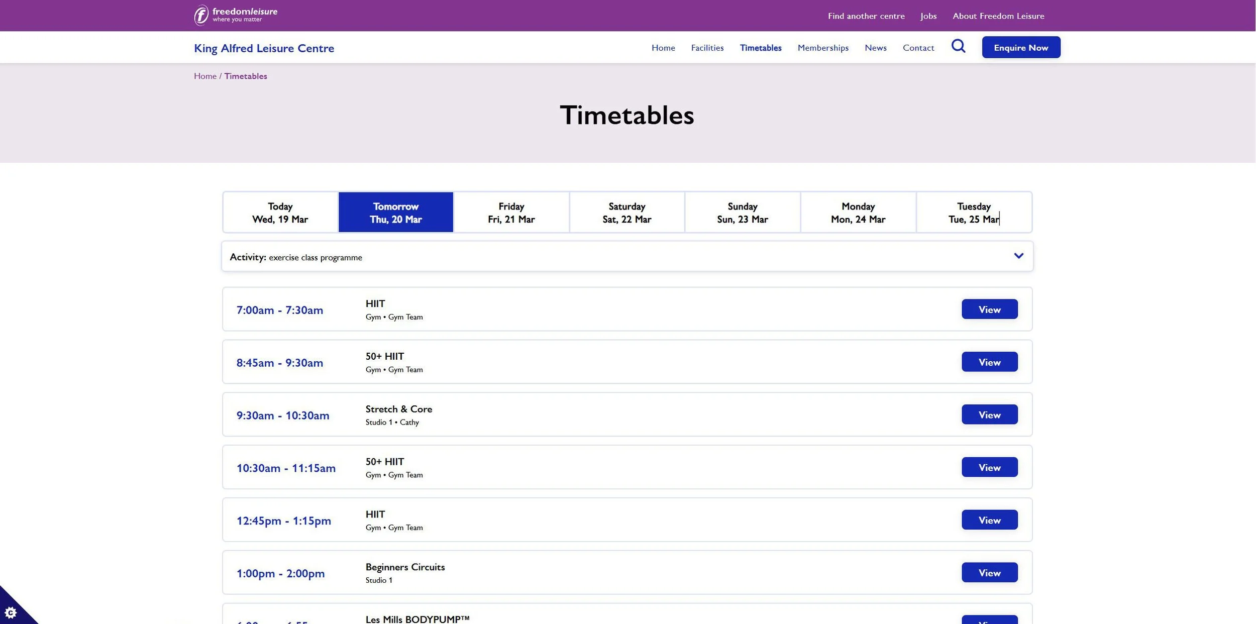
Present booking flow. Purple colour shows modern website screens and grey one is used for the outdated page.

Homepage

Outdated booking page
Despite the leisure centre using a modern up to date website, their online booking system made users wonder if the leisure centre was still in business.
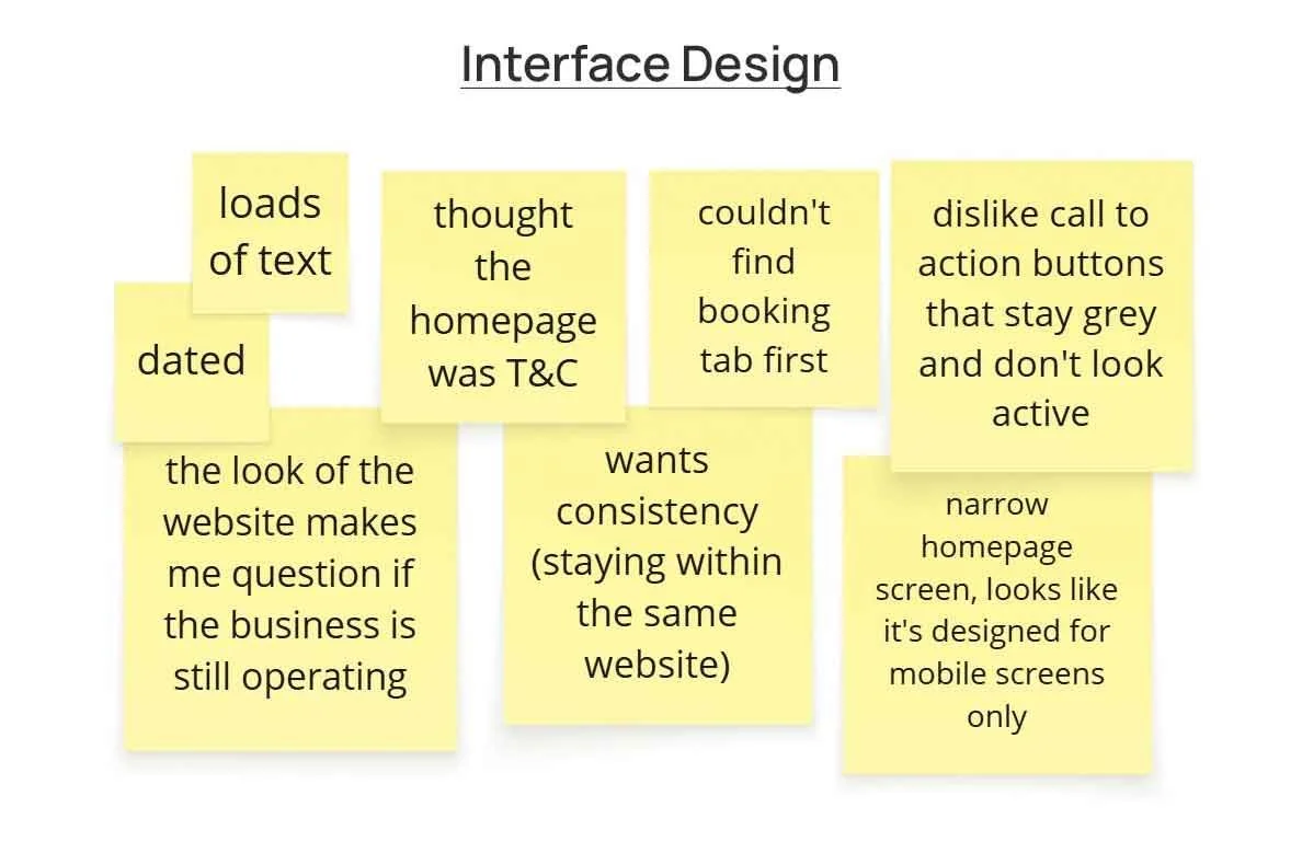
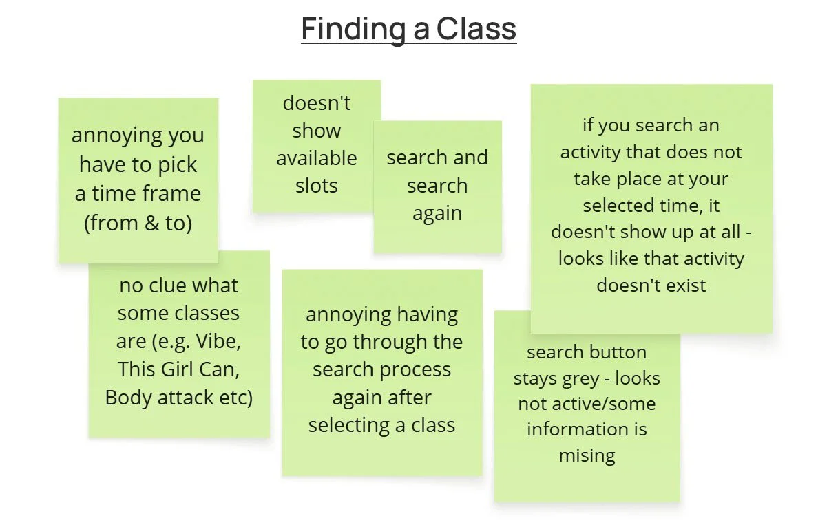
To synthesise the findings from the interviews, I organised the notes using affinity diagramming and grouped them into distinct themes.

Insights
From the affinity diagramming themes above, I derived several insights:Users need consistency within the website interface because inconsistency affects their navigation and makes the website difficult to use.
Users need a more straightforward booking process because the current one is lengthy
and confusing.
Users need description for the activities because they don’t understand what some classes are.
Users need clear call to action buttons because grey buttons makes them think that some information is missing.
Redesign
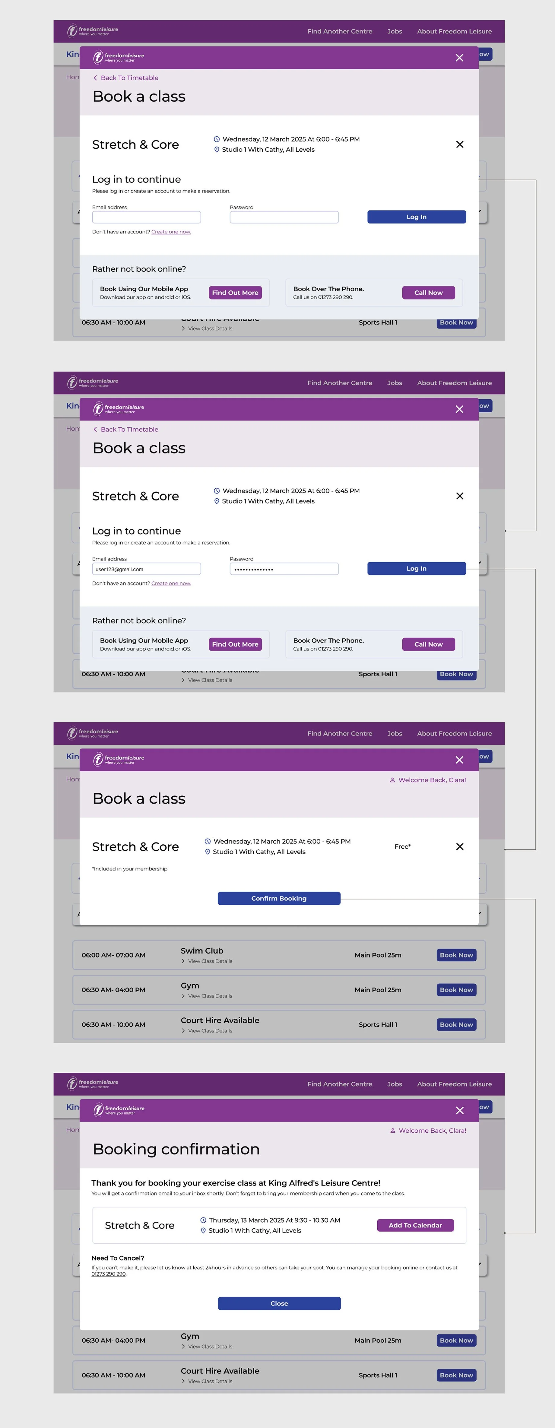
For the booking flow, I designed a pop-up window to streamline the booking process. This decision was informed by a competitive audit conducted during the research phase.
It revealed that many local competitors, such as Revitalise, used a pop-up approach, particularly for users who couldn’t log in directly to their websites.
To ensure the new designs aligned with the established brand identity, I incorporated the Freedom Leisure tab at the top of the interface and included reminders about alternative booking options, such as booking over the phone or through the Freedom Leisure app.
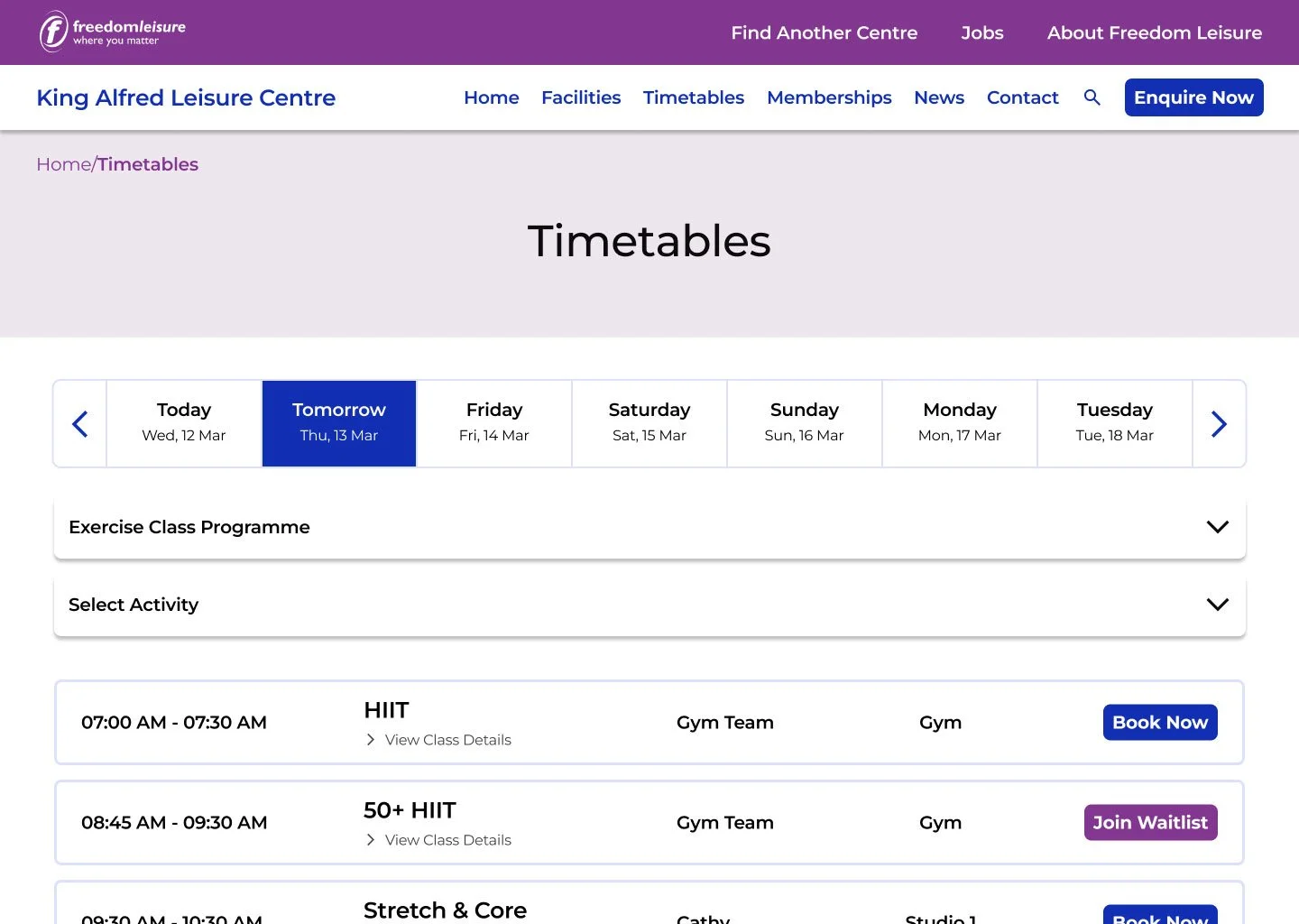
Regarding the existing timetable design, I expanded the range of available dates by adding arrows on both ends of the days. While it is unclear why this feature has not been already implemented, the current outdated system does allow users to book activities up to a week in advance.
This update would give users a better chance to secure spots in high-demand classes, improving overall usability.
Original design
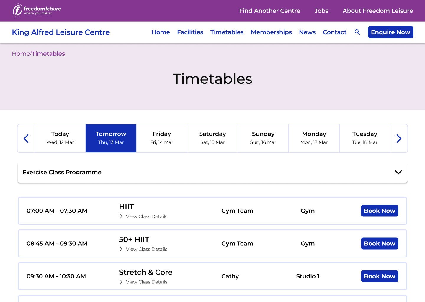
Redesign
In addition, insights gathered from user interviews revealed that some users prefer to book classes based on their availability. To accommodate this preference, I introduced an additional drop-down menu, allowing users to select a specific activity after filtering the results to show only exercise classes.
Furthermore, I believe it would be beneficial to indicate on which days the selected activity is available or takes place by upgrading the calendar feature to show specific days as active or inactive.

Lastly, I added a view class description option so customers could find descriptions for the class straightaway.

KPIs
Time on Task
For this case study, I chose to calculate time on task by measuring the amount of time it takes a user to book a stretch and core class on an actual and prototype versions of the website.
I chose this specific KPI in order to evaluate if my prototype version will help users to complete the task quicker and eliminate any pain points, improving the overall user experience.
-
For the moderated usability study, I chose 6 participants, most live locally in Brighton and Hove as well as one that lives in Norwich. Their ages ranged between 23 - 57.
-
The study itself took the users through a booking flow if they were already a registered user.
Both tests started at a selected timetable page where a stretch and core activity was available.
In addition, users were provided with my own existing user details to log in into an actual King Alfred’s booking system account.2 out of 6 users were unable to complete the task on a Freedom Leisure website so the table below compares the times of the rest 4 users that successfully completed both tasks.
-
Users were testing out the actual website while thinking out loud, which made it longer for them to complete the task
Some users were testing it on different browsers (tests that were done remotely) that were providing different user experience. We found out that between Google Chrome, Safari and Microsoft edge, Safari was the best one to accommodate the outdated pages of the website.
Some users had previous experience booking through the outdated website system which gave them an advantage
More insights could have been achieved with larger user sample
Since selected usability study participants came from my close circle, it is likely that some of the results are biased
Redesign is following established brand identity
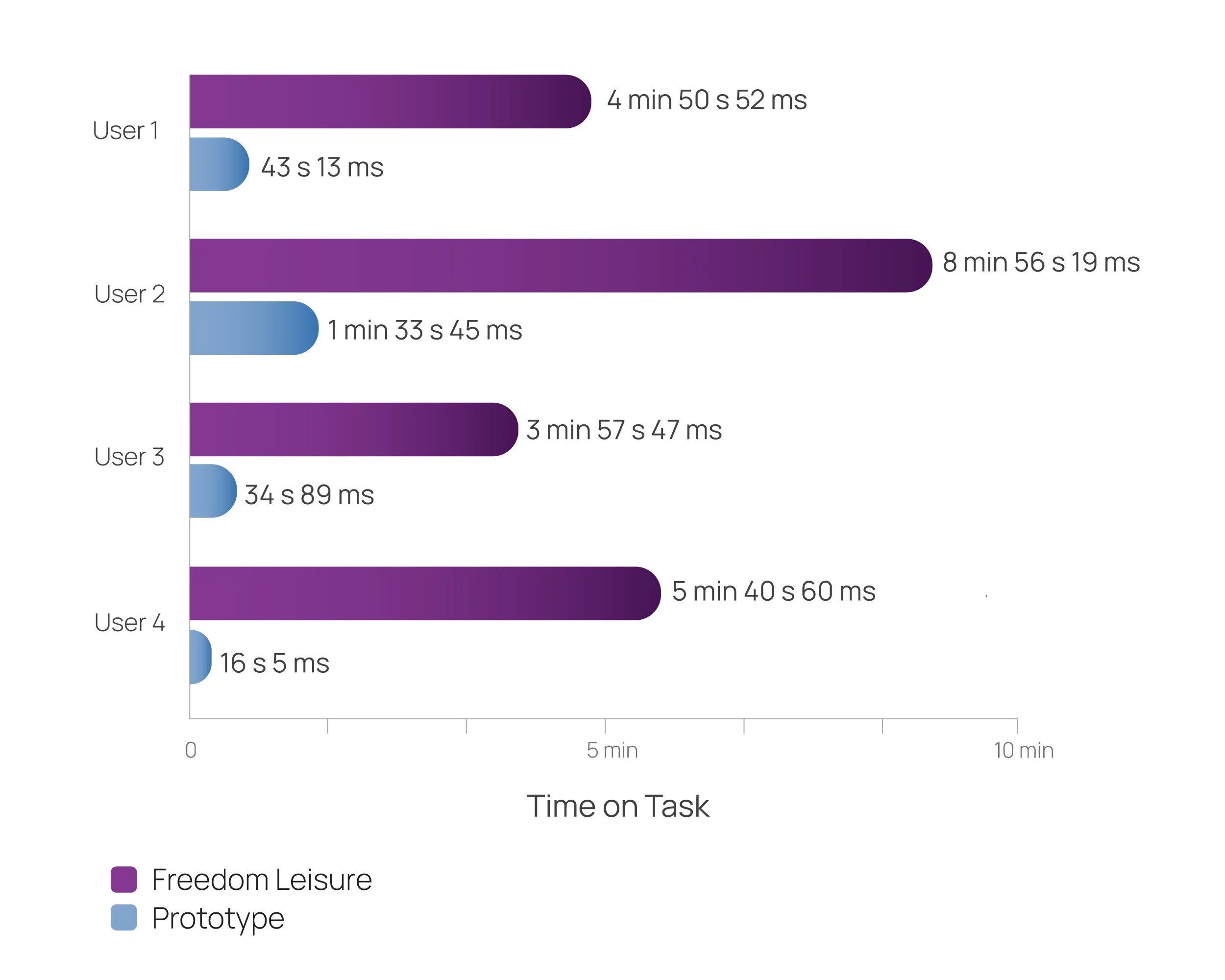
Results: Based on the data above, users completed the task 86.73% quicker on a prototype version than on an actual freedom leisure website.
Interesting findings about the browser experience
During the usability study, we noticed that Safari provided the best user experience for the outdated search window of the website.
The main pain point for users was that when selecting a specific activity, other drop down options would become non responsive, making them reload a page in order to continue their search or having to start it from the beginning. Options for date and time would become non responsive, despite that activity still being available.
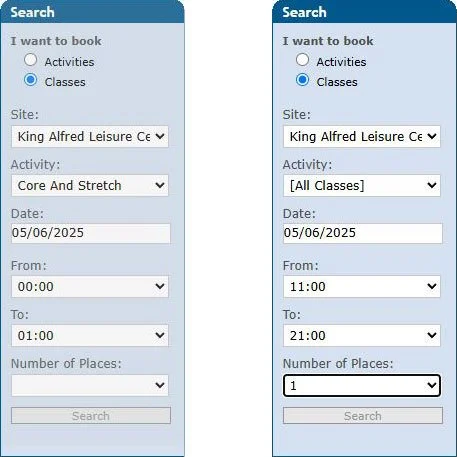
On the left - search window becomes unresposive once a specific class is selected. On the right - active search window despite the search button staying the same grey colour like in the unresponsive window.
I discovered that the best option to find a class and to successfully book it, was by selecting to show a timetable for all activities instead of a specific one.
System Usability Score (SUS)
Another metric for this study was calculating SUS (system usability scale) score for both website experiences. This helped to set a measurable usability benchmark based on users perspective.
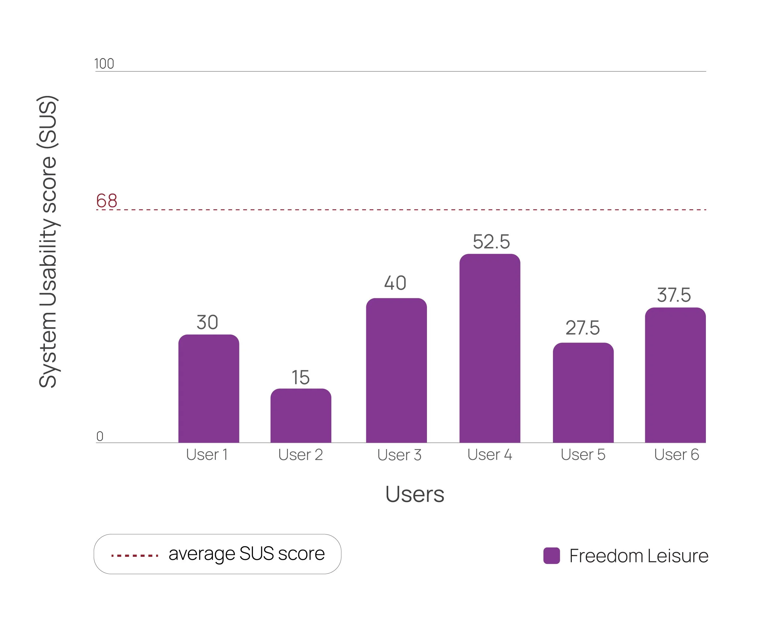
Freedom Leisure SUS scores
All freedom leisure SUS scores were below average, indicating that the usability of the website could be improved.
User impressions of Freedom Leisure booking system:
“It’s so simple that it’s from the stone age. Everything is very slow and navigation on the website is unclear. The inconsistency between pages and the repetition of stages is irritating as well.”
“The website was very difficult to navigate. There were too many things to look at and take into consideration. The interface was very outdated. The texts were quite small with lots of empty spaces that wasn’t being utilised.”
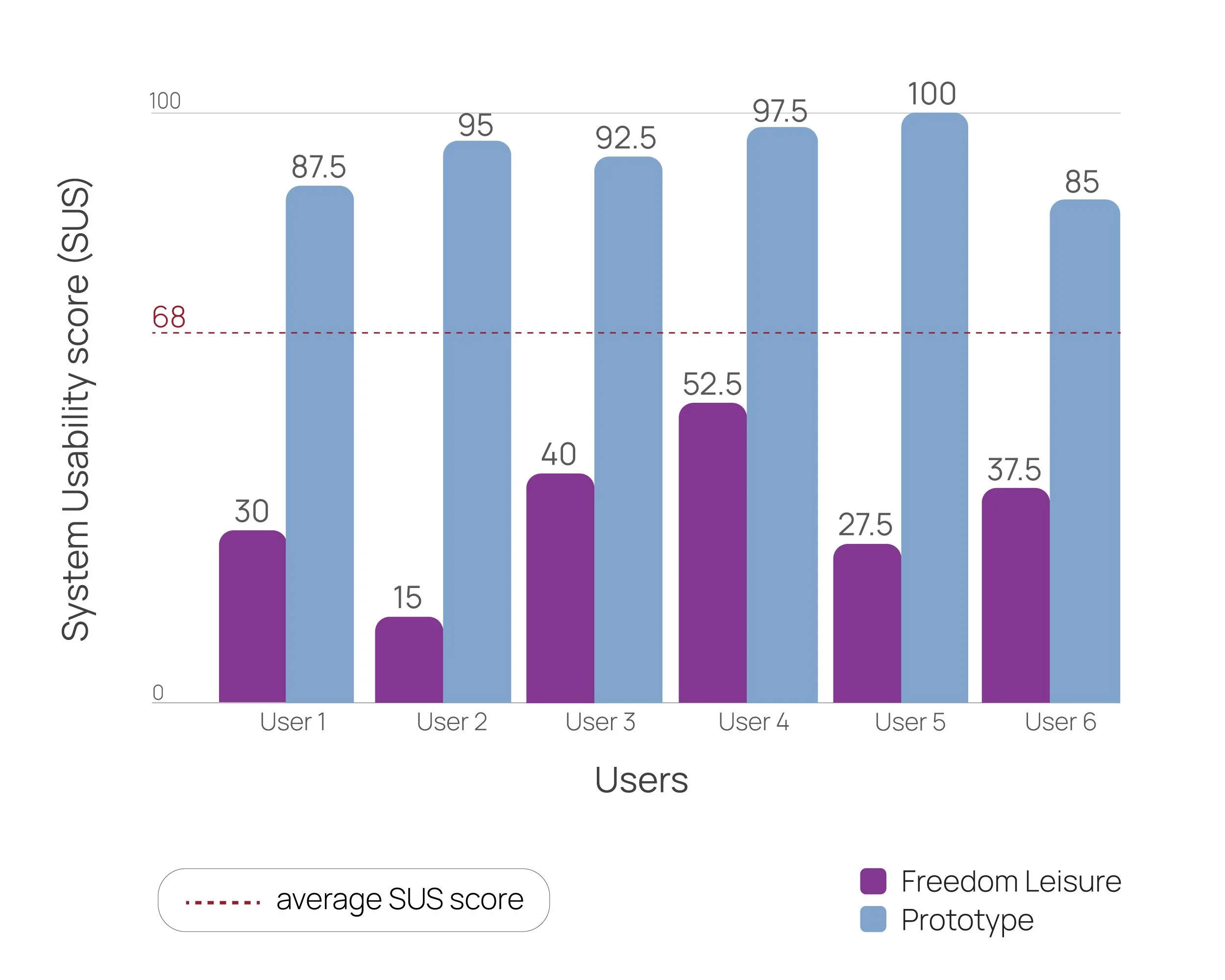
Prototype version SUS scores
It was great to see that SUS scores of a Prototype were considerably above average, with one score being 100. This means that the usability of the prototype version was of a higher level of perceived usability.
User impression of the Prototype booking flow:
“A lot easier to navigate and without any unnecessary stages in the booking process. Everything’s great, just a small confirmation mark at the end would be nice.”
Following user’s feedback, I improved a booking confirmation window with more information:

Updated booking confirmation screen
Next steps
1. Introducing a join waitlist button and creating a flow for users to join a waiting list for a fully booked class.
2. Improving Freedom Leisure mobile app experience and redesigning its UI in line with brand identity.

Current look of the app
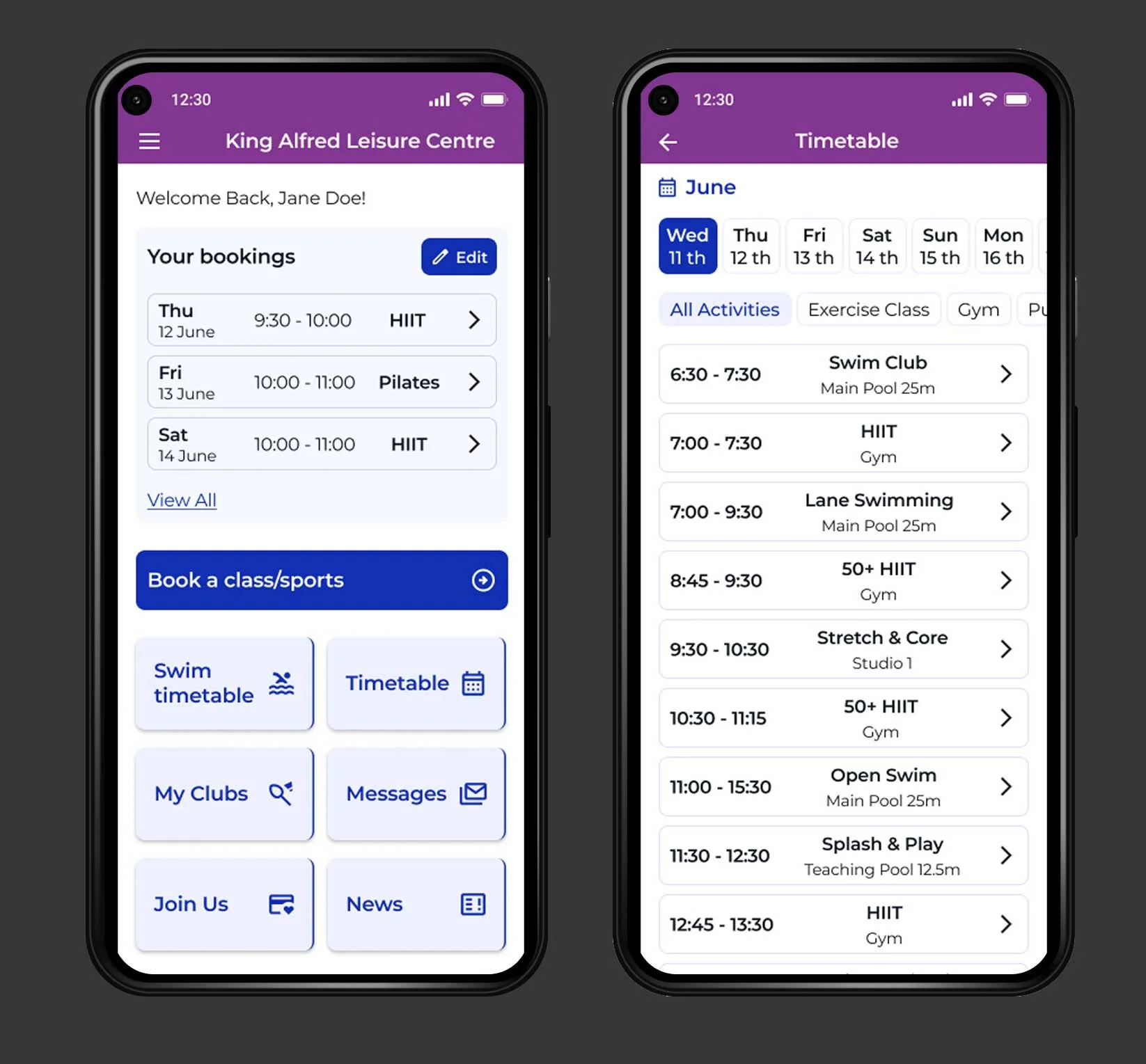
Redesign